Scenography
Contents
On soft grids and anti-tables
"How many Versions could a DiVersion DiVert if a DiVersion could DiVert Versions?"
The scenography of DiVersions manifested, among other forms, in two exhibitions, one in 2019 and one in 2020, two moments in the timeline of a project which began in 2016.
The first element introduced to this visual universe was the idea of unstable repetition. Avoiding straight lines in favour of waves and skewed angles, which when repeated would make up our grids and surfaces. The idea of continuous echoing and layering was a way to show the versioning that was at the center of the project. Other elements such as the instability of floppy grids, stability of angled surfaces, disorder which is contingent on the spectrum of scale or repetition followed.
Table as in relation, table as in surface
The online collections that each of the works in the exhibitions explored, WikiMedia, the Carmentis database from the Museum for Art and History and the website of Werkplaats Immaterieel Erfgoed, all rely on databases as a way to organise their content. These particular databases use tables, which consist of columns and rows, to hold a collection of related data together. Vertical fields and horizontal records divide, regroup, classify, derive or relate objects to each other, they query, arrange and rearrange elements in a fast, imperceptible choreography.
For the physical exhibition in 2019, the surfaces supporting the works were anti-tables. Putting together planks of wood at 45 degree angles created a surface of peaks and valleys. Objects were either stood up on multiple peaks, or laid into grooves that could be used as holders or cells to layer objects in rows behind each other, such as prints, or the cups visitors were using for their drinks. One anti-table was accommodated by chairs and created specifically as a gathering point, a table to be used by visitors, workshops, panels or other events. This opened possibilities of an interaction where relation started from an unstable ground, and where the audience could figure out for themselves how they preferred to use these (anti-)functions.
In the online translation of the exhibition, the zigzag shapes were picked apart into isolated elements of skewed wooden planks, and turned into skewed description panels accompanying the project icons, which changed place with every mouse click. This continuous soft-grid hopping was a way to make use of the digital space as a room that can expand beyond the linear experience of a door that frames your entrance and exit.
We are reminded by Liz Wells that exhibition design, much like a database table, “involves imposition of order on objects, brought into a particular space and a specific set of relations with one another.”[^liz] However, the order that emerged by the items re-shuffling in the viewport was not imposed, but instead emerged from chance juxtapositions. As the items keep moving around the page, they leave behind a trace of their previous position.
[^liz]: “Curatorial Strategy as Critical Intervention: The Genius of Facing East,” from Judith Rugg and Michèle Sedgwick, Issues in Curating Contemporary Art and Performance, 29.
The icons for each project were made by manually repeating the automatised process of image making Zoumana Meïté and Martino Morandi used in their work, [A new fire ceremony]. For each work, image elements were taken from the 2019 exhibition that resonated with their new iteration. This deteriorated documentation served as layers of orientation linking the two versions of the works.
De-stabilising the grid with flotsam and jetsam
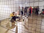
In the physical exhibition of 2019 the grids in use were black safety nets strung up on thin wooden frames and suspended from the ceiling. They sliced up the exhibition space into different cells, and with a mask-width of 10 cm their transparency made it possible to look through the layers.
In 2020, the grids were refracted in a digital environment through the multiplication of a hand-drawn gif. An L-shape moving like a wave gave the appearance of an interlaced background, where the softness of the individual moving lines disappears within the mechanics of the repetition. As the icons for the works kept jumping around atop of the gif grid, it reminded us of what in maritime terms is called flotsam and jetsam, pieces of shipwrecks or drift wood, as the projects resembled items unintentionally caught in a fishing net.
Versioning design
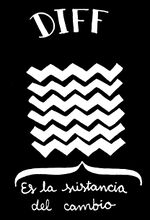
When we first showed a sketch of the black zigzag anti-tables to Femke and Elodie, Femke took out an image. It was by a group of illustrators from Madrid called Collaboratorio de Relatos, who had been inspired by the element of difference in distributed version control systems, such as git. Translated from Spanish, the caption reads "The Substance of Difference". The image stayed with us and influenced our works in the workshop, where we took a picture of the anti-tables in process. This image was then sent to Sarah and Gijs who were working on the first Mediawiki publication, leading them to also adopt zigzagging shapes in their graphics and a similar colour scheme. Later on, the design of the first version of the publication in turn influenced the design of the online exhibition space, which used the same typefaces and added gold in its colour scheme. In yet another turn, squigglegifs and soft grids could later be spotted on a "2 minute cup" and in the publication. And so the turn taking has continued ... ≈≈≈

Multiplication of disorder
In the end a lot of our experimentation had to do with trying out spectrums of range and multiplication. Observing at which stage of repetition where, for example, a squigglegif reads as a mechanical grid instead of manifesting its hand drawn, wonky, manual qualities. Or where picking a pattern apart to its singular elements can reveal surprising shapes.
This kind of soft gridding was our way to play around with disorder and scale; once the disorder scales, it starts looking like order. Which begs the question, is something still considered scalable if scaling it makes it become something else?
And how does disorder move from the physical to the digital? Digital space has no gravity and only two dimensions. In physical space there is a natural disorder that comes from people passing through a three dimensional space, gravity pulling objects down, things balancing, tumbling, cracking or tearing. Digital space has less people, for example there is no cleaning personnel because visitors don't leave their used paper cups and pretzel crumbs behind on the website. But disorder still manifests in other ways, through browsers displaying the work differently, web standards changing, domain names expiring, code becoming deprecated.
In making the scenography for the two shows we have in the end acted much like the databases we started out with, making systems and relations between the works and arranging them in contained spaces. However, unlike databases, the relationality between elements has not been considered as finished, but instead been made and remade with every version.


